 The letters I and J follow each other in the alphabet and look a lot alike. So it comes as no surprise to discover that our ninth and tenth letters started out as the same character.
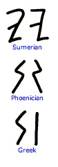 The Phoenician ancestor to our present I was a sign called “yodh,” meaning “hand.” The original Phoenician symbol evolved over time into a zigzag shape that was eventually adopted by the Greeks. The Greeks often simplified the symbols they borrowed, and the yodh was no exception. As used by the Greeks, the zigzag became a simple vertical line. The Greeks also changed the name of the letter to “Lota.”
Lota was the smallest letter of the Greek alphabet and, as such, has come to mean “a very small amount.” The word “jot” also derives (via Latin) from the Greek lota, and usually refers to a small note or mark.
Like the G and F, the letter I took its time deciding which sound it represented. The Phoenicians used it as a semivowel, as the ‘y’ in toy. When the I was adopted by the Greeks around 900 B.C., they used the letter to represent the long ‘ee’ vowel sound. Then, in early Latin, the I represented both the vowel ‘I’ and the semivowel ‘y.’
 Eventually, somebody must have grown tired of using one letter to represent two wounds, and so na attempt was made to differentiate them by lengthening the I slightly to represent the semivowel. In the 16th century, a lettering artist decided that merely lengthening the the letter was too subtle a change, and added a hook to the bottom of the J.
Both the lowercase I and J have a dot, but there are two competing theories as to which got its dot first. One theory maintains that the J was the first, with the dot added during the 13th century in an attempt to further distinguish J from I. The other theory posits that the I was dotted first (also during the 13th century), and that the dot’s purpose was to help distinguish the I from straight characters like the M, N and U when it appeared near these letters in blocks of text copy.
And you know you can have a great deal of fun just looking at all the letters “J” that have been created!
… and thanks for reading!
![]()
Thank you Allan Haley for this historic minute.
Allan Haley is a long time hero of the Design Center, and his expertise in typography and typographic design is second to none. His clients include Apple, Adobe, Linotype, Xerox, IBM, and Agfa Monotype among others. He is also currently the Chairman of the Advisory Board of the Goudy International Center at RIT. Allan was executive vice president of ITC, And before that was in charge of typographic development at Compugraphic Corp. (now Agfa Monotype). He writes for publications such as U&lc, How, Dynamic Graphics, and Step-by-Step Graphics. He is highly regarded as an educator, and he is a frequently requested speaker! Thank you Allan Haley
- See all my pins on Pinterest. . . including
- The years of the typography blog . . .
Enjoy our January poster . . . first published in 2009