One must keep in mind that although typefaces may have come into use at a particular point in time, they often continued in general use far beyond that time. So, we continue our “Brief History of Typography” looking at type forms through the ages!
Even after the rise of old style typefaces in the late 1600s, the blackletter* type was commonly used for setting text for several centuries (well into the 1900s in Germany). With later interpretations of earlier forms being relatively common, the style of a given typeface may belong to a quite different period from that of the typeface itself! Further, many typefaces have very complex histories: a type could have been originally designed in metal at one time, reworked by someone else later, made into a phototypesetting face by another person, and then later created in digital form by yet another designer — who might have been working off of any of the above as the basis of their work.
The classification system used here (old style, transitional, modern, sans serif, slab serif, etc.) has the virtues of being both simple and widely used. However, the precision and artistic accuracy of this system is perhaps dubious: see Robert Bringhurst’s*Elements of Typographic Style or his article in the first issue of Serif magazine* for a more thorough system. [Interview with Robert Bringhurst]
Definitions
Contrast: The degree of difference between the thick and thin strokes ina font (if any).
Stress (axis): The angle at which contrast occurs, usually ranging from vertical to a somewhat back-slanted diagonal. This can best be noted by looking at, for example, the letter “O” and noting if the bottom left is thicker than the top left, and the top right is thicker than the bottom right. If this difference exists, the letter has diagonal stress. If the two halves of the “O” are a mirror image of each other, with the sides thicker than the top/bottom, then the letter has vertical stress. If the top and bottom of the “O” are the same thickness as the sides, there is neither contrast nor stress.
Serifs: Those “finishing strokes” or “fillips” going off the ending lines of a letter. For example, when the number “1” or the letter “i” are drawn with a bar across the bottom, the two halves of the bar are serifs. If the serif is joined to the letter by a slight flaring out, it is said to be “bracketed.”
Early Letterforms
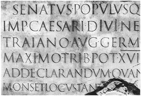
Although writing itself can be traced back to several millennia B.C., to Egyptian hieroglyphics and Sumerian cuneiform inscriptions, modern letter forms have their most immediate heritage in Roman inscriptions from around 50-120 AD, such as the one on the base of the Trajan Column in the Roman Forum (114 AD). A digital version called Trajan, by Carol Twombly* was created for Adobe in 1989.
Although early Latin writing was heavily influenced by these chiseled-in-stone letterforms, over the centuries it evolved into a variety of other shapes, including uncials and the related Carolingian script. It is through this period of the sixth to tenth centuries that we see the development of the lower case (minuscule) letter as a different shape from the upper case (capital).
Type forms similar to what we now think of as “normal” letter shapes evolved from the Carolingian (or Caroline) minuscule*. The Carolingian letters are so-called because of their adoption by the Emperor Charlemagne* (late 10th century) as a standard for education. Digital revivals of these exist, such as Carol Twombly’s Charlemagne (1989).
By the fifteenth century, italics also existed, in the form of a cursive script which had developed in Rome and Florence. However, italics at this time were a completely separate entity from the upright letterforms, as they remained in the early days of printing.
Blackletter
The first printed types exemplify what most people think of as medieval or “old English” lettering, with ornate capitals, roughly diamond-shaped serifs, and thick lines. As a group, these typefaces are called “blackletter.” They evolved from the Carolingian by a gradual movement towards narrowing and thickening of lines. View examples Blackletter fonts
The general sort of blackletter used by Gutenberg in his first Bible* is called textura (Wilhelm Klingspor Gotisch). The other sorts of blackletter are Fraktur, bastarda (Duc De Berry) and rotunda (Tuscany). Probably the most common blackletter revival typefaces in use today are Cloister Black
and Fette Fraktur
developed by Morris Fuller Benton, 1904, and Joseph W. Phinney.
It is worth noting that although these typefaces seem very hard to read to us today, this is due as much to familiarity as to any objective lesser clarity. Fraktur was in use in Germany well into the 1900s, though it was gradually being superseded by Roman typefaces. The Nazisat first fostered a return to Fraktur, then outlawed it as a “Jewish typeface” in 1940.
Studies from mid-century found that people can read blackletter with a speed loss of no more than 15%. However, there is subjectively more effort involved. Blackletter is today most appropriate for display or headline purposes, when one wants to invoke the feeling of a particular era.
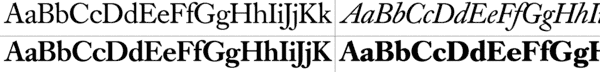
Old Style Typefaces
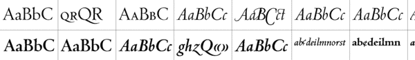
CentaurBemboJensonCaslon (of which there are literally thousands of iterations)
Garamond
E.P. Goldschmidt, as explained by Stanley Morison*, claimed that “the supersession of black-letter was not due to any ‘technical advance,’ it was the visible expression of a changed attitude of mind.” The Renaissance* was typified by an obsession with things “classical,”* in the Greco-Roman* sense, which had major implications for typography. The neo-classical letterforms were somewhat more condensed than the Carolingian shapes, but much rounder and more expanded than the blackletter.
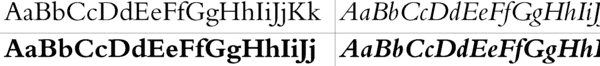
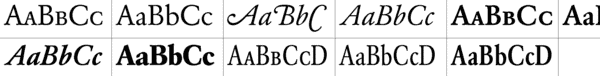
Old style type is generally considered “warm” or friendly, thanks to its origins in Renaissance humanism. The main characteristics of old style typefaces are low contrast with diagonal stress, and cove or “bracketed” serifs (serifs with a rounded join to the stem of the letter). The earliest (Venetian such as Jenson, or , such as Goudy Old Style Roman) old style typefaces (originally 15th-16th Century) have very minimal contrast, and usually a sloped cross-bar on the lower-case “e.” One such is Bruce Rogers’*Centaur (1916), based on Monotype’s Bembo (1929) is based on the work of Francesco Griffo*, thought to have designed the first italic typeface, circa 1499.
Italics at this point were still independent designs, and were generally used completely separately; a whole book could be set in italics. Probably the most famous italic of the period is Arrighi’s (1524), which may be seen today as the italic form of Centaur. Likewise, the italic form of Bembo is based on the italic of Tagliente (also 1524).
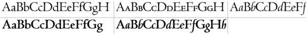
Later or baroque old style type (17th Century) generally has more contrast, with a somewhat variable axis, and more slope of italic. The most common examples are the types of Caslon and Garamond
Return to the first page of “A Brief History of Type” Also see : Fonts & Typography through the Medieval AgesAnd, … Thanks for reading
Editor/Publisher : DTG Magazine
Published online since 1988, including 60-Seconds and
Follow DTG on Facebook!

 Even after the rise of old style typefaces in the late 1600s, the blackletter* type was commonly used for setting text for several centuries (well into the 1900s in Germany). With later interpretations of earlier forms being relatively common, the style of a given typeface may belong to a quite different period from that of the typeface itself! Further, many typefaces have very complex histories: a type could have been originally designed in metal at one time, reworked by someone else later, made into a phototypesetting face by another person, and then later created in digital form by yet another designer — who might have been working off of any of the above as the basis of their work.
The classification system used here (old style, transitional, modern, sans serif, slab serif, etc.) has the virtues of being both simple and widely used. However, the precision and artistic accuracy of this system is perhaps dubious: see Robert Bringhurst’s* Elements of Typographic Style or his article in the first issue of Serif magazine* for a more thorough system. [Interview with Robert Bringhurst]
Even after the rise of old style typefaces in the late 1600s, the blackletter* type was commonly used for setting text for several centuries (well into the 1900s in Germany). With later interpretations of earlier forms being relatively common, the style of a given typeface may belong to a quite different period from that of the typeface itself! Further, many typefaces have very complex histories: a type could have been originally designed in metal at one time, reworked by someone else later, made into a phototypesetting face by another person, and then later created in digital form by yet another designer — who might have been working off of any of the above as the basis of their work.
The classification system used here (old style, transitional, modern, sans serif, slab serif, etc.) has the virtues of being both simple and widely used. However, the precision and artistic accuracy of this system is perhaps dubious: see Robert Bringhurst’s* Elements of Typographic Style or his article in the first issue of Serif magazine* for a more thorough system. [Interview with Robert Bringhurst]

 Although early Latin writing was heavily influenced by these chiseled-in-stone letterforms, over the centuries it evolved into a variety of other shapes, including uncials and the related Carolingian script. It is through this period of the sixth to tenth centuries that we see the development of the lower case (minuscule) letter as a different shape from the upper case (capital).
Type forms similar to what we now think of as “normal” letter shapes evolved from the Carolingian (or Caroline) minuscule*. The Carolingian letters are so-called because of their adoption by the Emperor Charlemagne* (late 10th century) as a standard for education. Digital revivals of these exist, such as Carol Twombly’s Charlemagne (1989).
By the fifteenth century, italics also existed, in the form of a cursive script which had developed in Rome and Florence. However, italics at this time were a completely separate entity from the upright letterforms, as they remained in the early days of printing.
Although early Latin writing was heavily influenced by these chiseled-in-stone letterforms, over the centuries it evolved into a variety of other shapes, including uncials and the related Carolingian script. It is through this period of the sixth to tenth centuries that we see the development of the lower case (minuscule) letter as a different shape from the upper case (capital).
Type forms similar to what we now think of as “normal” letter shapes evolved from the Carolingian (or Caroline) minuscule*. The Carolingian letters are so-called because of their adoption by the Emperor Charlemagne* (late 10th century) as a standard for education. Digital revivals of these exist, such as Carol Twombly’s Charlemagne (1989).
By the fifteenth century, italics also existed, in the form of a cursive script which had developed in Rome and Florence. However, italics at this time were a completely separate entity from the upright letterforms, as they remained in the early days of printing.
 E.P. Goldschmidt, as explained by Stanley Morison*, claimed that “the supersession of black-letter was not due to any ‘technical advance,’ it was the visible expression of a changed attitude of mind.” The Renaissance* was typified by an obsession with things “classical,”* in the Greco-Roman* sense, which had major implications for typography. The neo-classical letterforms were somewhat more condensed than the Carolingian shapes, but much rounder and more expanded than the blackletter.
Old style type is generally considered “warm” or friendly, thanks to its origins in Renaissance humanism. The main characteristics of old style typefaces are low contrast with diagonal stress, and cove or “bracketed” serifs (serifs with a rounded join to the stem of the letter). The earliest (Venetian such as Jenson, or , such as Goudy Old Style Roman) old style typefaces (originally 15th-16th Century) have very minimal contrast, and usually a sloped cross-bar on the lower-case “e.” One such is Bruce Rogers’* Centaur (1916), based on Monotype’s Bembo (1929) is based on the work of Francesco Griffo*, thought to have designed the first italic typeface, circa 1499.
Italics at this point were still independent designs, and were generally used completely separately; a whole book could be set in italics. Probably the most famous italic of the period is Arrighi’s (1524), which may be seen today as the italic form of Centaur. Likewise, the italic form of Bembo is based on the italic of Tagliente (also 1524).
Later or baroque old style type (17th Century) generally has more contrast, with a somewhat variable axis, and more slope of italic. The most common examples are the types of Caslon and Garamond
E.P. Goldschmidt, as explained by Stanley Morison*, claimed that “the supersession of black-letter was not due to any ‘technical advance,’ it was the visible expression of a changed attitude of mind.” The Renaissance* was typified by an obsession with things “classical,”* in the Greco-Roman* sense, which had major implications for typography. The neo-classical letterforms were somewhat more condensed than the Carolingian shapes, but much rounder and more expanded than the blackletter.
Old style type is generally considered “warm” or friendly, thanks to its origins in Renaissance humanism. The main characteristics of old style typefaces are low contrast with diagonal stress, and cove or “bracketed” serifs (serifs with a rounded join to the stem of the letter). The earliest (Venetian such as Jenson, or , such as Goudy Old Style Roman) old style typefaces (originally 15th-16th Century) have very minimal contrast, and usually a sloped cross-bar on the lower-case “e.” One such is Bruce Rogers’* Centaur (1916), based on Monotype’s Bembo (1929) is based on the work of Francesco Griffo*, thought to have designed the first italic typeface, circa 1499.
Italics at this point were still independent designs, and were generally used completely separately; a whole book could be set in italics. Probably the most famous italic of the period is Arrighi’s (1524), which may be seen today as the italic form of Centaur. Likewise, the italic form of Bembo is based on the italic of Tagliente (also 1524).
Later or baroque old style type (17th Century) generally has more contrast, with a somewhat variable axis, and more slope of italic. The most common examples are the types of Caslon and Garamond
