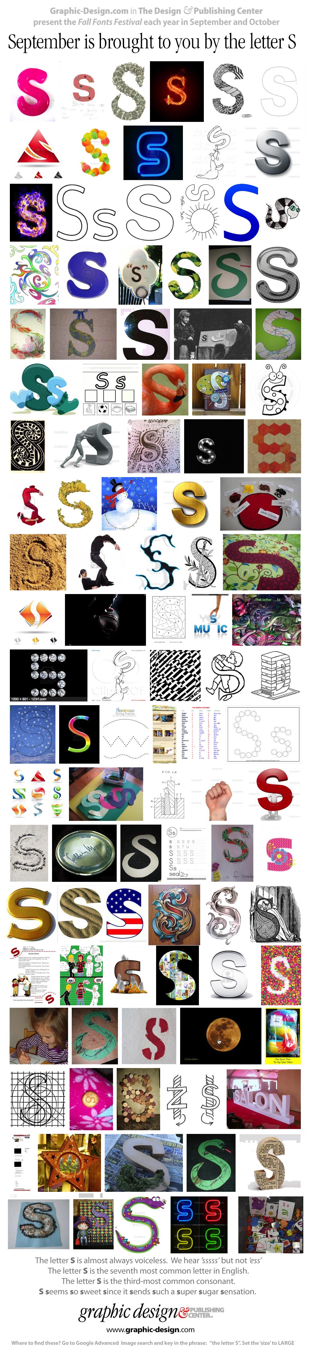
September is brought to you by the letter S
... The Letter S is so sweet and sexy since it sends such a sugar sensation!
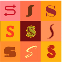
Any way you look at it, the letter S is a complicated letter. Not only is it one of the most challenging letters to draw, but the story of its evolution has more twists, turns and reverses than its shape!
The serpentine saga of our 19th letter gets its first false start with the early Egyptians and their hieroglyph for the 's' sound, which was a drawing of a sword. Later, in the Egyptians' hieratic writing, the sword was simplified until it looked more like a short piecce of barbed wire than a weapon of war. When the Phoenicians built their alphabet on the Egyptian model, they rotated the piece of barbed wire 90 degrees and called it "sameth," which means a post. The Greeks adopted this letter but not as a true 's' sound. Consider this a major reversal in the evolutionary road.
The letter "S" is the nineteenth letter of the Latin alphabet and a consonant in English, pronounced "ess."
At the same time that the Egyptians were using the symbol of a sword to represent the 's' sound, they also used a drawing that represented a field of land to represent the 'sh' sound. Like other hieroglyphs, the field symbol was simplified during the transition to hieratic writing. But unfortunately for the Egyptian scribes, the symbol's usage became more comples. The reason? The Egyptians allowed as many as nine different versions of the symbol to exist at the same time. There were so many, in fact, that one wonders how they kept track.

The Phoenicians dropped most of these Egyptian 'sh' characters and settled on something that looked like our W to represent the 'sh' sound in their language (the symbol, aptly, represented teeth). The Phoenicians called their version of theletter "shin" or "sin."
The Greeks borrowed the shin from the Phoenicians but drew it with three, four and sometimes even five strokes. In some cases it hardly resembled the original Phoenician symbol, but in each the basic zigzag shape of the letter was maintained. In its final Greek form the character became the sigma, which resenbles our present capital M laying on its side.
The Romans used a form of sigma which omitted the lower horizontal stroke of the character and made it look a little like a backward Z. Over time the Romans changed the sharp angles of the sigma into softer, rounded forms and finalized the letter into its current graceful shape.

Does the story of S end here, with the ancient Romans?
Not quite; there are still a few twists and turns left. In English manuscripts of the 17th century, a lowercase version of the letter was modified to look remarkably like our lowercase f and stood for a long 's' sound. Even today, the German language uses a letter which resembles a capital B (probably made up of a long and a short s), to represent the double lowercase s in words like "Strasse" and "Weiss."
Thank you Allan Haley for this historic minute in typography history.
Allan Haley is a long time hero of the Design Center, and his expertise in typography and typographic design is second to none. His clients include Apple, Adobe, Linotype, and Monotype among others. Allan was executive vice president of ITC, and before that was in charge of typographic development at Agfa Monotype. He is highly regarded as an educator, and he is a frequently requested speaker. I met him through the Dynamic Graphics (DGEF) conferences series.
- Take a stroll through the trails of Allan Haley
- Ten thousand Esses from Google (just keep scrolling!)
- 497 Positive Words That Start with the letter S
- Here's how to draw the Letter S!
Please enjoy our “Letter S” poster suitable for printing and framing!
Thanks for reading

Don't forget ... we encourage you to share your discoveries about favorite or famous graphic designers and illustrators with other readers. Please post your suggestions and comments at DT&G on Facebook for discussion, or give me a tweet at @DTG_Magazine
➤ DT&G ➤Facebook ➤ X ➤ Medium ➤ Quora
© 1993 60-Seconds.com © DT&G 1988–2026 · All rights reserved. DT&G Magazine, and is a spam-free, ad-free, tracker-free, script-free, predator-free, stalker-free web site. 60-Seconds is a member of, and supporter of SafeNetting SpamCop.net, SpamHaus.org and UGNN InfoManager. DT&G (Design, Typography & Graphics) is a reader-supported, independent online publication established in 1988. It has been published continuously through successive online platforms—including commercial online services, email distribution, and, since 1995, the World Wide Web. There are no terms of service, no cookies and we won't spam you. DT&G is not interested in your identity other than what you wish to share with us in terms of talent, creativity and discoveries. The content here is protected by copyright and many trademarks are the property of their perspective owners. But none of our web sites require anything from you whatsoever other than a smile, a like and a share if you're so inclined.
FAIR USE NOTICE: This web site may make use of copyrighted material. Such material are made available for commentary and educational purposes only. This constitutes a "Fair Use" of any such copyrighted material as provided for in TITLE 17 U.S.C. SECTION 106A-117 of the United States Copyright Law.