
Which type styles are best?
... questions from our workshop attendees
This is a loaded question even though it comes up at least once at almost every workshop. The selection of type styles is largely a matter of personal taste and utility. The answer is usually different for each example. To understand what works and what doesn't, some basic rules should be observed.
First, you should always be careful not to allow typographic technique to be its own goal. These days the DTP and design writers in magazines are having a tough time coming up with things to write about. Typography is always an easy hit, so we're continually reading about this rule or that. Sooner or later the uninitiated will begin to assert some of these techniques just for the sake of the technique.
Kerning*, for example, was highly popularized with some of the early DTP programs. Suddenly every headline and title was kerned. Although that's OK when done properly, and in good taste, kerning for the sake of kerning usually turns out to be obvious to the reader.
People read for a specific purpose.
Anything that stands in the way of the reading process is wrong. The communication process must be the sole purpose of any inventiveness. I urge you to ask four questions about any typographic project you're about to undertake:
1. How can I best expose the meaning of the text?
2. How can I make the reading seem easy?
3. How can I make understanding effortless?
4. How can I present this type so it will be perceived as "reader-friendly"?
Remember: these should be the goals of design applied to typography. All creativity and imagination should be applied strictly to the service of these goals.
Typefaces speak to your audience
You should always select a typeface that speaks to the audience in a tone that best reflects the subject matter without sacrificing readability. Your type combination will usually work when you establish and maintain a type hierarchy. Type weight is all-important in reinforcing your message levels. Headlines become heavy, subheads become bold, text is medium (perhaps even light) and italics for stress or emphasis.
Following these rules you can't go wrong.
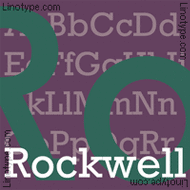
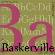
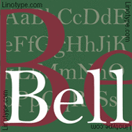
Serif typefaces are best used for text. They are more comfortable to read, and lead to quicker understanding. I personally like text faces that have rounded or near-pointed serifs because they allow more white space in and around each character. Slab-serif style faces like Rockwell, City, and even square serif Egyptian are a little less friendly than faces like Baskerville, Bell or Garamond. Newer faces like Stone Serif and Galliard also make for fine reading.
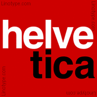
Sans-serif type is usually ideal for display type like headlines, subheads, pull-quotes and captions because it is "type that stands apart." Sans can be used to add impact to a layout. I personally like the classic sans-serifs like Helvetica, Frutiger, and Franklin Gothic. (I really like Franklin Gothic Condensed for an excellent all-purpose, heavy sans-serif!) You may like some of the more modern sans faces like Syntax Sans, or Kabel. You'll also find sans to be the better selection in forms, and table text.
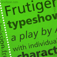
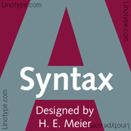
Without the serifs however, there will be less differentiation between letters, so the sans style can become a barrier to readership. Sans-serif type always needs a bit more white space around surrounding the characters and setting
[Editor's note: later, with the advent of internet publishing, it's been established that Sans Serif fonts like Helvetica, Arial and Verdana are better for body text. Given the right sizing and leading, I don't necessarily agree with that premise.]
Display and Decorative Fonts
Display or decorative fonts like Lithos, Hobo, Papyrus, Comic Sans and others should be used with great discretion. These fonts are intended to be more ornamental than informative, so they should be reserved for headlines and display only. Script and Black fonts (Cursive, Old English, Celtic, etc,) fall into this category as well and should NEVER be used in all-caps or in text situations. Never. Mark that down.
As to helping you decide which fonts to use, I urge you to experiment. Allow yourself plenty of time and try various combinations. Remember to tack your proofed-out laser pages on the wall and stand back.
❓ Do the faces work together❓
❓ Are there sufficient reader clues❓
❓ Does the "look" support and reinforce the intentions of the copy❓
Try Helvetica Black Condensed for heads contrasted against Garamond light for text. You'll find that your subheads don't need to be much larger than the body text to grab real impact, to "lead" the reader. If you're looking for a bit more progressive look, try Antique Olive for heads and Bulmer, Palatino or Melior Light for text. (Melior's square-oval circles are the perfect pairing for Olive.)
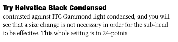
Many pros use the same family!
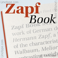
For homogenous design, where you use the SAME FACE for all the text, look for a serif with just a little personality so your heads and display type will have a little distinction. Try Zapf Book for it's smart extravagance, or Trump Mediaeval for its classic posture. To push the envelope, try Silica.

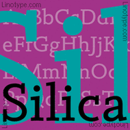
At the end of the day, there's no best font...
only the best font for your message, and your readers!
All of the above are merely suggestions. The final decision is up to you. If it is easy to read, and communicates the feeling of the message or audience, you'll probably come up with a hit, no matter which face you use!
Thanks for reading

Don't forget ... we encourage you to share your discoveries about favorite or famous graphic designers and illustrators with other readers. Please post your suggestions and comments at DT&G on Facebook for discussion, or give me a tweet at @DTG_Magazine
➤ DT&G ➤Facebook ➤ X ➤ Medium ➤ Quora
This article "Which type styles are best?" was originally published in 1993, as part of our responses to workshop attendees in our Dynamic Graphics "Creative Layout Techniques" seminars. The original page, much like this one was destroyed in July of 1999, when hackers took down our web provider Network Solutions The Design Center had to be rebuilt from the ground up.
© 1993 60-Seconds.com © DT&G 1988–2026 · All rights reserved. DT&G Magazine, and is a spam-free, ad-free, tracker-free, script-free, predator-free, stalker-free web site. 60-Seconds is a member of, and supporter of SafeNetting SpamCop.net, SpamHaus.org and UGNN InfoManager. DT&G (Design, Typography & Graphics) is a reader-supported, independent online publication established in 1988. It has been published continuously through successive online platforms—including commercial online services, email distribution, and, since 1995, the World Wide Web. There are no terms of service, no cookies and we won't spam you. DT&G is not interested in your identity other than what you wish to share with us in terms of talent, creativity and discoveries. The content here is protected by copyright and many trademarks are the property of their perspective owners. But none of our web sites require anything from you whatsoever other than a smile, a like and a share if you're so inclined.
FAIR USE NOTICE: This web site may make use of copyrighted material. Such material are made available for commentary and educational purposes only. This constitutes a "Fair Use" of any such copyrighted material as provided for in TITLE 17 U.S.C. SECTION 106A-117 of the United States Copyright Law.